I know some of us are familiar with the county tracking website where we log all the counties we’ve visited and generate a map of where we’ve been. I even have my own map there, but I haven’t updated it in a couple of years. The user input on that website relies on you manually clicking on whichever counties you want to log as visited. Many of us like statistics, and we like to track where we’ve been. As a GIS Analyst, I love maps. I love mapping data and analyzing that data on maps as well. I thought I could do a post (or a series of posts) on using GIS to generate maps from our storm chasing shenanigans.
Ingredients
This post will be a how-to guide on using some free GIS software to generate maps like at the aforementioned county tracking website, but without all the manual clicking. First thing’s first, here’s what you’re going to need to pull this off:
- GPS Logs from your chase in NMEA or GPX format. If you don’t already have GPS Logs, then this tutorial won’t work for you. If you’re running GPS Gate on your computer while you’re chasing, you should always be logging it to a file as one of the output options. I have a blog entry on how to set that up here.
- IF your GPS logs are from GPSGate, they’re in .nmea format which QGIS does not natively open. You’ll need to download GPS Babel to convert it! There’s Windows, OS X and Linux flavors at that link as well.
- QGIS is an open source desktop GIS package. It’s a rather impressive piece of software and you’ll need to download and install it to follow along with this tutorial. This link will take you to their download page, just grab the appropriate standalone installer from the first two links under “For New Users” depending on whether you are running a 32-bit or 64-bit version of Windows. Of course, if you’re using OS X or Linux, there are versions available for those operating systems as well.
- You’re going to, at a minimum, need a shapefile for the counties in the United States to display in QGIS. I’ve packaged together a zip file with the counties and states for use with this tutorial HERE!. Extract those files somewhere you can remember on your computer.
If you haven’t already, go ahead and install QGIS. Once QGIS is installed, it’ll stick a bunch of icons on your desktop. The one we’re interested in is QGIS Desktop, which looks like this:

Creating our county map in QGIS!
Go ahead and double click that and fire it up. QGIS takes a few moments to load, but once it’s up you’ll be staring at a large blank canvas with an uncomfortable number of toolbar buttons and panels surrounding it. It has kind of a Photoshop vibe to it in that it becomes obvious this program can do a lot of stuff.

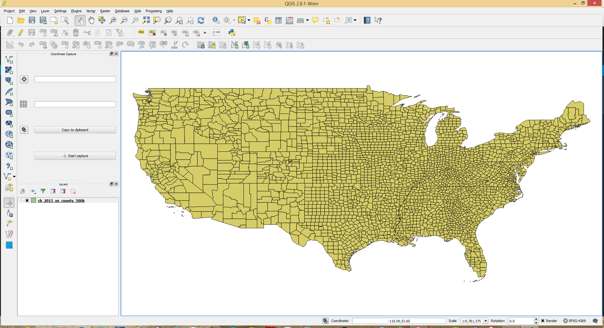
Anyway, the first thing we want to do is get our counties shapefile in here. To do that there’s a vertical toolbar on the left and the topmost button is the button for adding a vector layer (which our county shapefile is) to the map.

The Add vector layer dialog has two sections
- Make sure the source type is set to File
- Click the Browse button and let’s go searching for that county outline shapefile you unzipped earlier.
- As a technical note, a shapefile is actually a collection of files, usually at least 4 and up to 8. These files contain different information for the display of the geographic information of the shapefile. It’s not important what each file means for this tutorial.
- We want to open the file that ends with a .shp extension, so find the folder you unzipped the shapefile to and select cb_2013_us_county_500k.shp and hit Open.
Your Add vector layer dialog box should look similar to this:
Now hit open and your blank canvas will now have a map of all the counties in the Lower 48. Ooh! Aah!

Some basic controls that you may be used to in other software can be used here. Rolling the mouse wheel will zoom in and out. Selecting the hand tool from the toolbar will let you click and drag the map around. Hover on the buttons in the toolbar to get the tooltips to get an idea on what all these buttons do.
You’ll also see it added the file to the layers list in the lower left hand corner panel. This works kind of like a layers pane in Photoshop, you can use the checkbox to toggle visibility. For our purposes, I think our county map should just be outlines. We can change how the map looks.
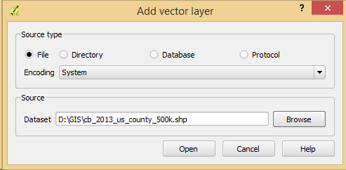
- Let’s right click on that layer in the layer pane and select Properties. This will bring up the Layer Properties for our counties layer.
- There are many things you can fiddle with in here, but we want to select Style from the left hand list. This will allow us to change the color and symbol properties for our layer.

- Underneath the colored square that represents how our counties are colored there is a section for Fill and Simple fill. We want to select the Simple fill, then on the right hand side change the fill style to No brush. This will make our county map just the outlines.
- Hit OK, now you should have a map that looks like this
Ok, cool. We’ve got our basemap. Now let’s see if we can add a GPS Log to this. The easiest way to get your GPS log into QGIS is if it is already in GPX format. However, GPSGate outputs the standard NMEA stream that’ll need to be converted, so I’ll show you how to do it either way. If you’ve already got a GPX file you can skip the next section!
Converting a NMEA Log to GPX
GPS Gate outputs to a .nmea log file if you’ve setup the file recorder like I mentioned above. We can use another piece of free software called GPS Babel to convert these to GPX files we can then load into QGIS. The beauty of GPS Babel is it allows you to chain files together into a single output, so let’s say you were out chasing for 4 days, you can make all 4 nmea logs as inputs into one output GPX which will contain your entire trip.
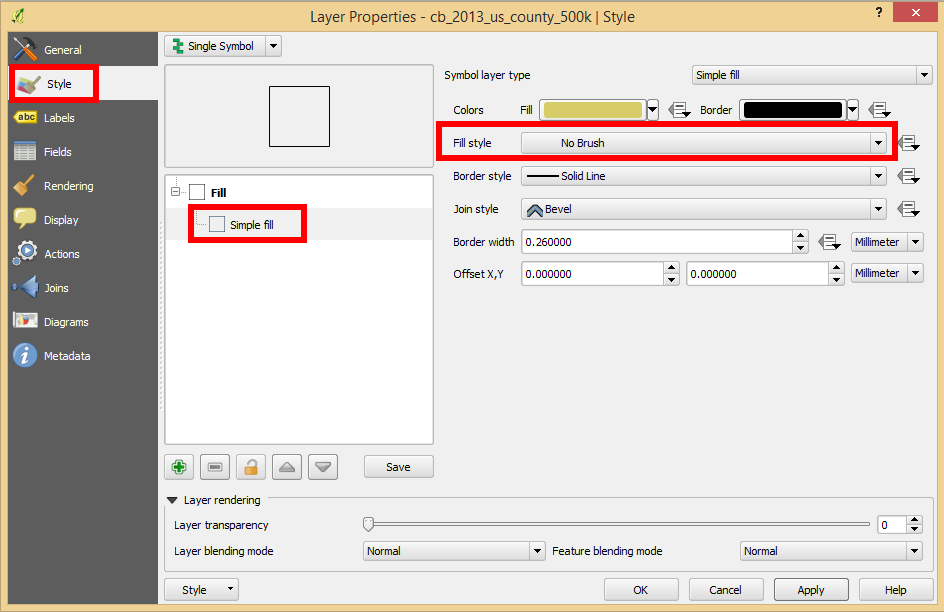
Fire up GPS Babel.
- In the input section specify that you’re providing a File
- From the Format dropdown select NMEA 0183 sentences. This is the format that most GPS devices use.
- Click on the File Name(s) button and select one or more .nmea logs to convert. In my example below I’ve selected my logs from my two day chase on April 8th and 9th 2015.
- Under the translation options we really only need the Tracks, which is basically a chronological connection of the waypoints into a line.
- In the output section specify that you’re outputting a File
- From the format dropdown select GPX XML.
- Click on File Name and specify an output filename, something like chase.gpx or whatever.
- Click on OK.
Once it’s done you should get a “Translation successful” message in the box at the bottom and you should have a new GPX file ready to use in QGIS, which the next section describes.
Loading a GPX File into QGIS
If you have a GPX file (or converted to one from earlier), awesome, QGIS can read these natively.
- In the menu at the top of the screen, select Vector -> GPS -> GPS Tools.
- NOTE: If you do not have the GPS item under the Vector menu you may need to install or turn on the GPS Tools plugin. You can do this by going to Plugins -> Manage and Install Plugins, use the Search to search for GPS Tools, then either install it or turn it on once you find it.
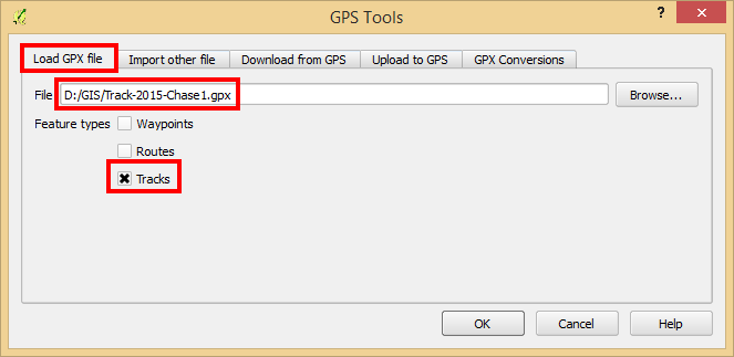
- This will bring up the GPS Tools dialog. You can then, simply, load the file under the Load GPX file tab, like so:
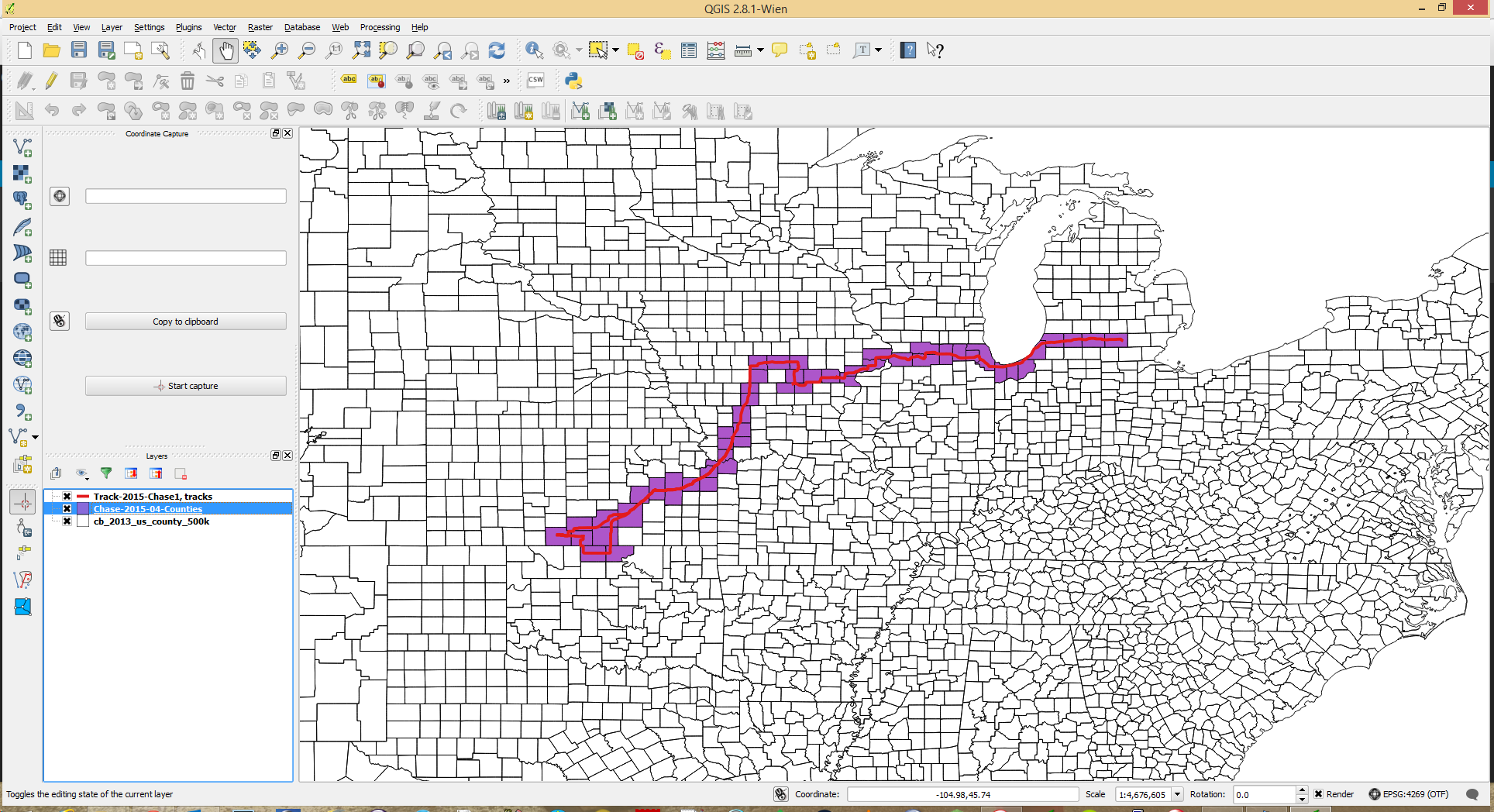
When you hit OK, a new layer should be added to the map and the layers pane in the lower left with the name of your GPX file. Depending on what color the program randomly assigns to your newly imported track it may be difficult to see, in my case it added it with a light green line which is almost impossible to see.

Let’s make the line a bit easier to see.
- Right click on your track in the Layers list and select Properties. This brings up the same window we used when we changed the color of the counties before.
- Under the Style section you’ll see on the upper right the color and width of the line. I usually like to change these to a bold red and .50 width.

- Hit OK and now you should have a map similar to this with a much more visible track:

If you right click on your GPS Track in the layers list and select Zoom To Layer, it will zoom into the area of the map that contains your track!
GIS Magic!
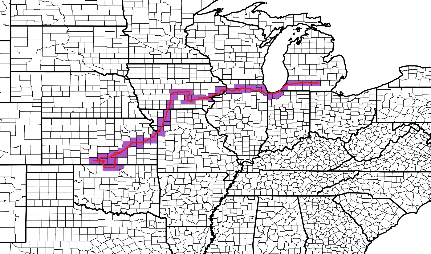
Now it’s time for the GIS magic. So, what counties did I visit on these two days? In GIS lingo, what we’re about to do is a spatial selection. Basically we’re going to select things in one layer based on the location of data in another layer. In our case, select the counties that our GPS track goes through.
- In the menu at the top of the screen select Vector -> Research Tools -> Select By Location.
- Since we want to highlight the counties we’ve visited, in the first dropdown labeled “Select features in:” select the cb_2013_us_county_500k layer. That is the layer with the counties in it.
- The next dropdown tells QGIS what layer we want to use to make the selection. In our case, we want to use our GPS track, so make sure that is selected.
- Only the first checkbox should be selected next “Include input features that intersect the selection features” Basically this tells QGIS to only select the counties where our line travels through.
- In the final dropdown, make sure it says “creating new selection“
- Your box should look similar to this
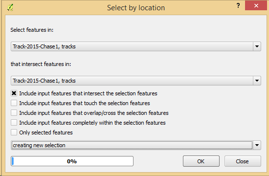
- Hit OK and the progress bar will migrate to 100% and when it’s done
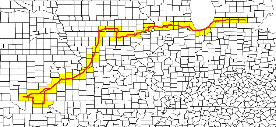
QGIS should have highlighted the counties your chase took you through! OK, cool, now what?
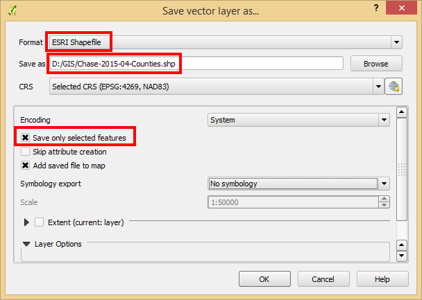
- Right click on the county shapefile in the layers list and click on Save As.
- From the Format dropdown select ESRI Shapefile
- In the Save as box, click Browse and give it a name for the output file, I chose Chase-2015-04-Counties
- Check the box that says Save only selected features
- Click OK
Now you should see a new layer in your layer list with the name you just provided. You’ve just created a brand new shapefile that just contains the counties from that chase trip!
Let’s spice up the map a little bit.
- Remember that zip file with the shapefiles you downloaded? Well there’s a State shapefile in there, so click on the Add Vector Layer button from before on the left side of the screen and find cb_2013_us_state_500k.shp. It should be in the same folder your county file was in.
- Hit Open and add that to the map. You should see a new layer in the layer pane with the same name, cb_2013_us_state_500k.
- Right click on that layer and select Properties…we’re going to go in and make them hollow with a thicker outline than the counties
- In the Layer Properties dialog under the Style settings, click on Simple fill and change the Fill style to No Brush.
- Change the Border Width to 1.0
Your Layer properties box should look like this:

Hit OK and now you should have nice, dark state outlines:
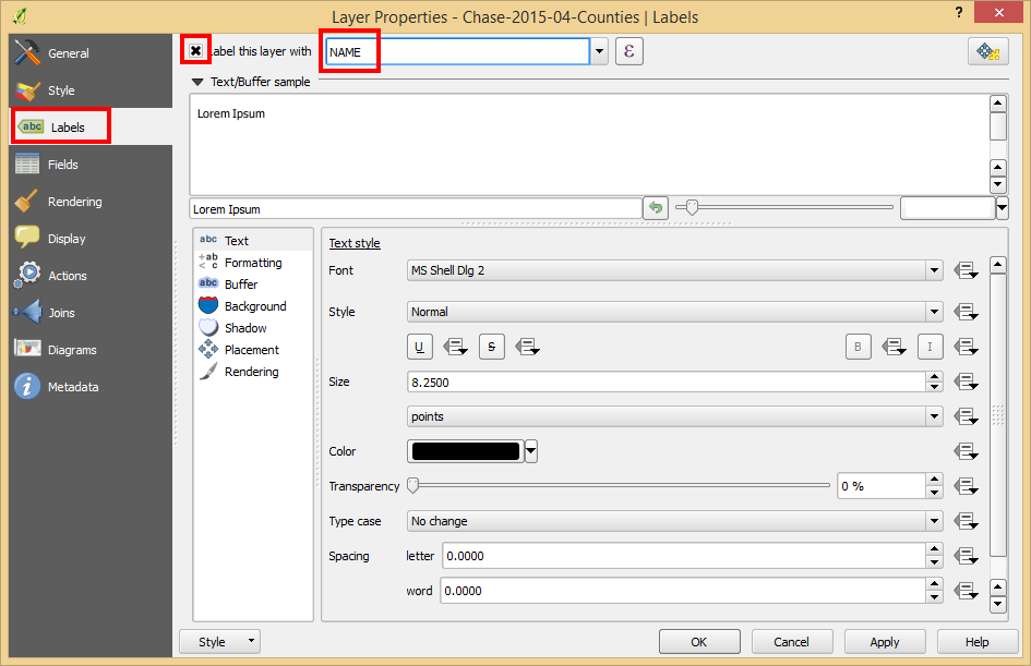
And, for one more thing we can mess around with, let’s say we want to label the counties visited with their name. No problem!
- Right click the layer that contains the colored counties we made earlier, in my case it’s Chase-2015-04-Counties
- Select Properties, this is the same Layer Properties box we keep going into, learn to love it.
- This time, select the Labels settings from the left side
- Check the box at the top that says Label this layer with and select NAME from the dropdown.
Your label dialog should look like this:
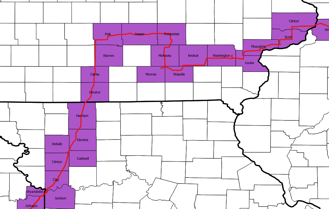
Hit OK and now you should see text labels on your maps on top of the counties you visited. They might not all label because of space constraints, but if you zoom in they should label fine. There are more settings in the Labels dialog that controls the placement and style of the labels including fonts and colors, feel free to poke around in there.
If you want to save this project just go to Project -> Save As and save it somewhere. When you reopen it, you will be able to continue where you left off.
The beauty of the GPS logs
I think that’s enough for the first entry in this series of storm chasing and GIS related blogs. Feel free to contact me in the Facebook comments below if there’s any questions you might have or suggestions you might have for future tutorials like this one!